Consultancy and Programming
Technical Pages
About Us

Advice, tips, techniques and downloads for Visual Foxpro developers.
Versión en espańol de este artículo
Version 1.1 of SimpleList was issued in March 2003. Please see below for a summary of the new features.
If you've experimented with the ActiveX controls that come with Visual FoxPro, you've probably come across the Microsoft ListView. This versatile control provides an attractive way of displaying data in a list, and offers a worthwhile alternative to VFP's native listbox and grid controls.
But while the ListView has some useful features, it can be frustratingly difficult to program. Unlike with a VFP grid, you cannot bind it to a table simply by setting a property, and even such mundane tasks as specifying the column headers require several lines of code.
If you like the idea of having a ListView in your applications but have been put off by its complexity, take a look at our SimpleList control. As its name suggests, SimpleList takes the hard work out of using a ListView. It is essentially a wrapper for the ListView control, its aim being to provide a simple cursor-based method of populating a list. In fact, once you have a cursor in place, you only need three lines of code to make your list appear. (Note that SimpleList requires Visual FoxPro 7.0 or later.)
To see a ListView in action, you need look no further than the right-hand pane in Windows Explorer. It is the ListView that provides the list of files and folders, with its familiar large icon, small icon, list and detail views. The ListView ActiveX control can provide that same kind of functionality in your own applications.
With typical databased applications, you'll probably only be interested in displaying your list in detail view (also knows as report view), as this provides the most intuitive way of viewing tabular data. However, the ListView does support the other three views as well. Figure 1 shows an example of detail view, while Figure 2 shows large icon view.
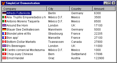
Figure 1: A ListView in detail view
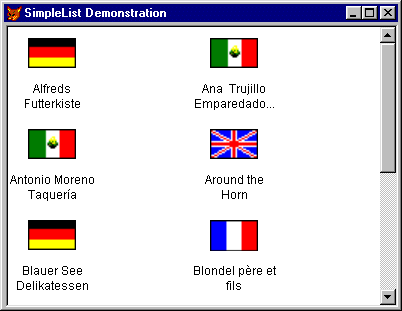
Figure 2: The same list in large icon view
As well as providing four different views, the ListView control offers several other benefits:
Although SimpleList supports most of the ListView's features, it does have some limitations:
So now you know what SimpleList can and cannot do, your next step is to download a copy - see How to download SimpleList, below.
SimpleList is completely free, and you are welcome to give copies to friends and colleagues. We ask only that you do not remove our copyright notices or disclaimers. We have tested SimpleList in our own applications, but we make no guarantees that it will work in yours, so be sure to test it thoroughly before relying on the results.
In the rest of this article, we will give you an overview of SimpleList's features. Our aim here is to give you a flavour of what the control can do. When you have download your copy, you will get a longer version of this article which gives full details of all these features.
To put SimpleList to work, follow these steps:
WITH THIS
.cAlias = "Customer"
.cData = "Company"
.PopulateList
ENDWITH
That's all there is to it. Let's just recap the above properties and methods.
cAlias
The alias of the cursor (or table or view) that contains the data for the list.
When you call PopulateList, the cursor must be open in the current data session.
cData
A comma-delimited list of the cursor fields that are to be used to populate the
list. You need to specify at least one field, and this must be a character
field. The contents of this field will show up in all four views.
You can optionally list more fields in the cData property. If you do, their contents will show up as separate columns in detail view, but they will be ignored in the other three views. These additional fields can be of any data type.
PopulateList
Call this method to populate the list with data from the cursor. Each time you
call it, the list will revert to its default view, column widths, sort order,
etc. If you want to retain these settings, call instead:
RefreshList
This will re-populate the list, but will retain the current view, column widths,
sort order, etc. You should call this method if the underlying data changes
after you have initially populated the list.
As another example, consider this cursor:
Company City Country Amount ------- ---- ------- ------ Alfreds Futterkiste Berlin Germany 6300 Ana Trujillo Emparedado.. México D.F.Mexico 3500 Antonio Moreno Taquería México D.F.Mexico 8500 Around the Horn London UK 17100 Blauer See Delikatessen Mannheim Germany 5000 Blondel pčre et fils Strasbourg France 22205 Bon app' Marseille France 27100 Bottom-Dollar Markets Tsawassen Canada 27800 B's Beverages London UK 11000 Centro comercial Moctez.. México D.F.Mexico 1000 Chop-suey Chinese Bern Switzer.. 17696 Ernst Handel Graz Austria 122900
The following code will produce the list shown in Figure 1 (but without the icons):
WITH THIS
.cAlias = "Customer"
.cData = "Company,City,Country,Amount"
.PopulateList
ENDWITH
Full details of the features described in the remainder of this article can be found in the documentation accompanying SimpleList.
By default, PopulateList displays the list in detail view. Use the nDefaultView property to specify a different initial view (0 = large icons, 1 = small icons, 2 = list, 3 = detail). Call ChangeView to subsequently switch to a different view (pass the required view number as a parameter).
By default, the columns headers in detail view will show the field names from the cursor. The columns will be left-aligned and will start out with equal widths. You can vary that behaviour in several way. You can provide different text to appear in the column headers; you can vary the initial widths of the columns and the alignment of the text within the columns; and you can choose to hide the column headers completely.
If you plan to display your list in large icon or small icon view, you will probably want to assign icons to the list items - after all, that is the whole point of those views. If you do assign icons, they will also show up in list and detail views. But it's your choice. If you are not interested in icons, you can ignore the issue.
SimpleList lets you specify a single icon to appear against each item in the list. Alternatively, you can specify a different icon for each item. To do that, you store the icon's filename in a field in the underlying cursor.
Each item in the list can have an optional tooltip containing the contents of any specified field in the underlying cursor. This is useful if you want to let the user see subsidiary information that would not otherwise fit in the list.
In detail view, you can optionally allow the user to sort the list by clicking on a column header. You can also specify an initial sort order and direction for the list, where this is different from the order of the underlying cursor.
If you have ever wanted to give your users a scrolling list of checkboxes, you will find this feature indispensable. Essentially, it lets you display a checkbox against each item in the list. This provides an intuitive way of making multiple selections, for example, to let the user choose the customers who are to appear in a report, or the reports that you want to send to a batch-printing process.
Going further, you can map the checkboxes to a logical field in the underlying cursor. The field will then be updated to reflect the current state of the checkbox.
By default, your list will be read-only. However, you can optionally give the user the ability to edit an item's text (in detail view, only the left-most column can be edited). You can further choose whether to write your own code to process the edits or to have SimpleList automatically update the corresponding field in the underlying cursor.
SimpleList supports drag-and-drop. When enabled, this lets the user drag an item out of the list and drop it in any control or application that knows how to receive it. For example, you can drop the text of an item into a native Visual FoxPro textbox or a Word document.
SimpleList cannot itself act as a drop target. In other words, you can drag items from the list, but you cannot drag anything to it.
You can modify the appearance and behaviour of your list in various ways. For example, you can decide whether grid lines should appear in detail view, and whether to enable 'hot tracking'.
SimpleList provides a variety of ways of getting information about what's in the list and which item the user has selected. You can retrieve the text, index number or record number of the selected item; you can retrieve the text, record number or checkbox status of any item; and you can programmatically select an item. You can also opt to keep the underlying cursor in sync with the list (so that, when the user moves the highlight, the record pointer in the cursor will automatically move to the corresponding record).
SimpleList lets you trap clicks, double-clicks and changes to the position of the highlight. However, it cannot distinguish between left- and right-clicks or between left- and right-double-clicks.
Here is a summary of the new features in SimpleList Version 1.1. These are all described in the SimpleList documentation.
Click the link below to download SIMPLELIST.ZIP. This zip file contains a class library, which in turn contains the SimpleList control. It also contains a longer version of this article (in both HTML and text format); this constitutes the full documentation for the control. The total download size is 66 KB.
We hope you find SimpleList as useful in your applications as we do in ours. As always, we greatly welcome your feedback (see our Contacts page).
Mike Lewis Consultants Ltd. September 2002. Revised March 2003 and January 2006.
FoxStuff is maintained by Mike Lewis Consultants Ltd. as a service to the VFP community. Feel free to download and use any code or components, and to pass around copies of the articles (but please do not remove our copyright notices or disclaimers).
The information given on this site has been carefully checked and is believed to be correct, but no legal liability can be accepted for its use. Do not use code, components or techniques unless you are satisfied that they will work correctly in your applications.
© Copyright Mike Lewis Consultants Ltd.